


Although it may seem like a big challenge to design a digital product for people with persistent disabilities, the designs that come out of this can actually benefit a lot more people. A disability can be temporary. Even a short-term injury can change people's interactions with their environment. For example, a product that was built to be easy to use by someone with one arm may be used just as effectively by someone with a broken arm or someone holding a heavy shopping bag. People may use the product in various situations. It is worth to make sure that the product gives them a great user experience, regardless of the circumstances.

Accessible design and inclusive design both aim to create digital products for people with various conditions to access. Although the two concepts are closely connected to each other, inclusive design focuses on designing products that are usable by a full range of users. The principles of inclusive design are about always putting people and their needs first and making sure that everyone is always involved.
The importance of colour in design cannot be overlooked. Proper colour use is important to create a positive experience for the users of your digital product. What about the experience of users who, due to certain visual disabilities, cannot rely on colour to guide them through the product interface? Colour blindness is the inability to distinguish certain shades of colour. There are an estimated 300 million people in the world who are colour-blind, which means a significant number of users in your audience group might be affected.
It’s important to ensure that your product is designed to assist and support those who have a degree of vision impairment. To achieve this, make sure that all your interface elements have an appropriate colour contrast ratio. Contrast ratio refers to how bright or how dark the colours appear on the screen. It ranges from 1 (written as 1:1) to 21 (written as 21:1). According to Web Content Accessibility Guidelines, colours can be used together if the contrast ratio between foreground and background is at least:
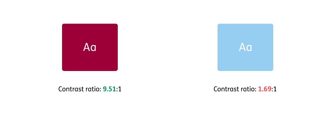 An example of ERGO’s Dark Red colour showing a positive contrast ratio according to the guidelines (on the left) and a pair of colours that do not meet the contrast ratio guidelines (on the right)
Being colour-blind does not mean that you cannot see some specific colours, it means you have a harder time differentiating between them. The most common type of colour blindness is red-green – two of the most frequently used colours in interfaces to indicate success and error states. With that in mind, make sure that the states in your interface are clearly distinguishable by more than just their colour. Using other elements like icons, shapes, patterns, appropriate cursor states and outlines can help users with visual impairments to easily spot the difference between the states of the component. Let’s look at this in the example:
Let’s consider three variants: in the first version the error state is represented by just the outline colour; in the second it is shown by the outline colour and an error message; and in the third by the outline colour and width, an error message and an error icon.
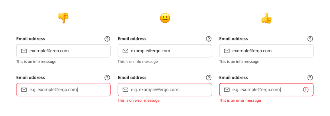 Error state of input seen by a person with no visual deficiencies
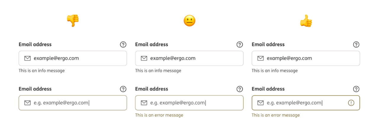 Error state of input seen by a person with protanopia - blindness to the colour red.
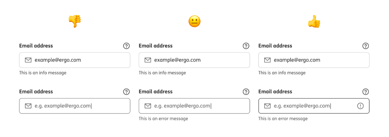 Error state of input seen by a person with achromatopsia - partial or total absence of colour vision.
For a person with no visual impairments, differentiating between these input states would not be a problem. In each case, the error state is easy to spot thanks to the brightness of the red colour.
But it would not be such an easy task for a colour-blind person. The difference between the red outline and the grey outline of the input in a default state is barely noticeable, and for some, it is not noticeable at all. By adding other visual elements besides colour (the error icon in the input field), it is now possible to also recognise the difference between the default and the error state for a person with impaired colour vision.
Colour blindness is not the only visual disability that needs to be considered while thinking of an inclusive user experience. Introducing dark mode in your product can improve the experience for people who suffer from light sensitivity or photophobia (eye discomfort in bright light), as it makes the screen of a digital device give out less light. It also makes reading easier for people without visual impairments.
According to Jacob’s Law of Internet User Experience: “Users spend most of their time on other sites. This means that users prefer your site to work the same way as all the other sites they already know. Design for patterns to which users are accustomed.”
What this means is that users are expecting your product to behave the same way as others do. So, to not confuse users, you should use common patterns and behaviours that they are already familiar with, so they know what actions to take without any additional learning. If you deviate, users may find your product unintuitive and hard to navigate, which in the end may cause them to leave your product and never come back. If your audience finds your product unusable, they simply won’t use it.
Remember that some users of your product might not be native speakers of your language, and some of your audience may have limited literacy skills. Make sure that the wording you use in your product is clear and consistent. Don’t confuse users with different ways of describing the same action. Try to avoid using overcomplicated words or jargon. Keep your sentences short. For the general public, you may aim for your copy to be written at the level of 8th grade or lower.
Building inclusive product language is as important as building accessible components. Don’t let your users feel left out. It’s crucial to not exclude anyone with your product message. From race and culture to gender, age and abilities, try to include everyone in your images, illustrations, and wording.
Everyone has both strengths and limitations, and everyone experiences exclusion in different ways, but there are people and communities who experience it more often than others. Let’s remember that disability is context-dependent. As designers, developers, project managers, product owners, engineers, and people who are generally involved in the process of creating digital products, we have the power to make decisions that can help decrease the level of exclusion between people and the world around them
Text: Aleksandra Bołdak, UX/UI Designer at ERGO Technology & Services
Most popular